
Whether you trade from a tick chart or a daily chart, it’s always useful to see price action from multiple timeframes and ensure they’re all telling a similar story. Technical analysis using multiple timeframes is a great way to do this.
Sometimes you’ll see a great setup on an intraday time frame like a 5-minute chart, only to see that the long-term trend on the daily and hourly charts are in the opposite direction. Time frame continuity is just one more way of putting the odds further in your favor.
Technical Analysis Using Multiple Timeframes
Trading is all about putting the odds in your favor in anyway possible. Beyond that, it’s also a game of risk management. Trading with multiple time frames will improve both of those things: it will ensure you’re taking higher probability setups, while simultaneously keeping you out trades where you’re trading against the wind, the trades that can haywire on you quickly.
In this article, we’ll go over the benefits of using multiple time frames as a day trader, and how using them can improve your returns, reduce your risk, and even put you in some home trades.
What Are Charting Time Frames?
Any modern charting package will have several time frames for you to pick from. A time frame is an interval that creates a new price bar. For example, a 5-minute bar means that a new candlestick/bar is created every 5 minutes, each one representing 5 minutes of market data.
Generally, the time frame you use for trading defines a few things: the amount you’re risking on a trade, and the amount of time you’ll be in a trade.
A setup on a 1-minute chart can take just a few minutes to play out: you can be in and out of the market in that time. The same setup on a weekly chart can take a couple of months to work out.
In addition to using longer term charts as confirmation tools, they’re also useful for identifying vital levels. A resistance level that has been respected on a daily chart for over a year is much more significant than a support level on a five minute chart that’s been respected only for a few hours.
Why It’s Important to Use Multiple Time Frames
Confirmation
We know that trading is all about putting the odds in your favor. You can’t predict what the market is going to do next, and most traders only win around half of their trades. It’s prudent to make sure that any trade you’re going to take has a reward/risk ratio skewed in favor of reward. We want our average winning trades to be much bigger than our average losing trade.
One way to put the odds further in our favor is to confirm trading setups and price action on multiple time frames. If you see a setup forming on a 1 minute chart, but the hourly chart looks like it’s playing against that setup, you’re not playing the odds.
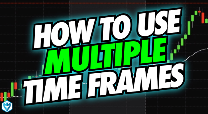
Let’s use an example. Here’s a 15 minute chart of Edwards Lifesciences Corp (EW):
There’s a clear downtrend, here. Lower lows and lower highs are constantly being put in, and the most recent impulse move downward was met with high volume, while it’s subsequent consolidation upward was on weak volume: a sign of trend continuation.
For many traders, this is a great opportunity to wait for a pullback to a lower high and get short. We might change our mind once we take a look at a different time frame though. Let’s look at a weekly chart of EW.

The stock has been in a very strong uptrend for several years at this point. There are institutions like mutual funds, hedge funds, and asset management firms buying more of this stock every month. Do you really want to be caught short, knowing that a huge buying program might be turned on by an institution at any time?
It’d be much more prudent to look for buying opportunities in a stock like this. This might seem obvious, but look back at some of the intraday trend trades you’ve made recently. Did you confirm price action on multiple time frames? If not, go back at some of your failed trades, and you might find that you were trading against the wind.
Many who utilize multiple time frames in their trading have rules for combining time frames. For example, they wouldn’t use monthly charts in conjunction with a 5-minute chart. Instead they’ll use one or two hour charts to support their 5 minute charts. This is a logical line of thinking, and it absolutely makes sense to use similar time frames in conjunction, but the highest probability setups occur when several time frames are in harmony with each other.
Getting a Different View
Sometimes you stare at one time frame so long, that you forget what the chart might look like in another time frame. You might stare at a five minute chart all morning and get so locked into it that you might not see a reversal happening on the longer time frame.
What looks like an uptrend on an intraday chart may be a lower high being formed on a daily chart. Sometimes looking at multiple time frames will change your bias completely. You may be looking for entries to get long, until looking at the daily chart prompts you to shift to looking for short setups.
Letting Trades Run
For many, trading returns follow the Pareto Principle: that roughly 80% of your returns come from 20% of your trades. Their trading account will be playing small ball for most of the year, taking small wins and losses, until those big trades come, and those are what the difference in your annual returns. You can allow your 20% to be losing trades or winning trades, it’s mostly a matter of money management.
Using multiple time frames is a great way to expose yourself to potential home run trades. It’s one thing to use hourly and daily charts to confirm a setup on a 5-minute chart, but if that’s all you’re using them for, you’re missing out.
You see, sometimes the setup you see on the 1 or 5-minute chart plays out on a longer time frame. A breakout on a 5-minute chart might turn into one on an hourly chart, which might turn into a daily chart breakout. The longer the time frame gets, the larger your gains will be, after all, we know that a daily chart breakout is more significant than one on an intraday chart.
In these situations, you will have gotten into the trade early, before the trend followers get in, giving you the opportunity to see the trade through further than them. These trades can be your year’s biggest winners.
Identifying Vital Levels
Perhaps you’re trading on a 5-minute chart and you identify a support level that has been defended several times. By going out to longer time frames, you can see how significant this level is, or if it’s just a short term level.
We know that support and resistance levels are formed by repeated buying and selling at specific levels, most of the time it’s institutions accumulating or liquidating a position. The difference between a support level on a 5-minute chart and one on a weekly chart is paramount.
A level that only exists on a 5-minute chart could be an ETF or mutual fund simply rebalancing. Once that’s done, the level is also done. A level on a daily or weekly chart, on the other hand, has been defended for weeks, months, or years. It’s clear that big fish have been accumulating or liquidating around that price for a long time, making it more likely for them to continue doing so.
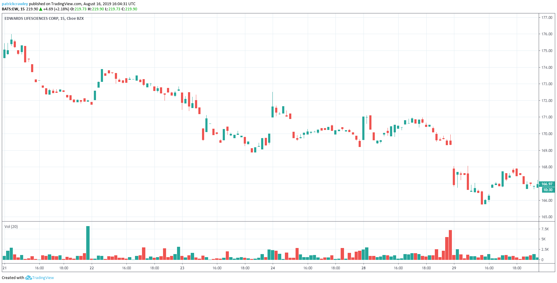
Here’s a 5-minute chart of Amgen. We immediately see pretty strong resistance around the $177 level.

Now, here’s a daily chart of Amgen, and we can see that the $177 level isn’t that important on a longer time frame.
How to Use Different Time Frames to Make Decisions
Below we have a 5 minute chart of Apple.

So we see a bit of a battle between bulls and bears above. The bulls are trying to break out above the channel on the open, but keeps getting denied, even on high relative volume. Observe the strong support level between $199 and $200, any tests of that level are denied on low volume.
That’s the price action we see on a 5-minute chart. A novice to intermediate trader might opt fade breakouts above that $206 level, or buy support around the $200 level. However, we’re not seeing the big picture. It’s important to put this 5-minute chart in the context of longer term price action. Doing so will give us more confidence in the levels we’re trying to trade.
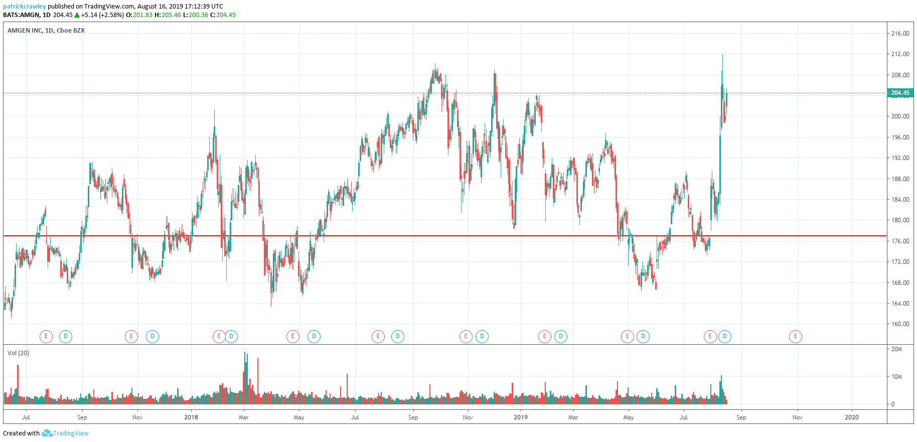
Even going out to the hourly time frame can give us a different perspective. Below is an hourly chart of Apple during the same period.

Suddenly, those ‘failed breakouts’ have different context. While the initial impulse moves are being rejected, the stock is still making higher highs and higher lows, as marked by the arrows on the chart, meaning the uptrend is still intact.
Going even further out onto the daily chart, we can see that Apple has been in an uptrend for all of 2019. While not the most technically strong uptrend, it doesn’t play in your favor to try to fade moves within the uptrend: you’re not playing the probabilities.
Final Thoughts
I think the importance of analyzing markets on multiple time frames was made pretty clear in this article. If it does nothing else but keep you out of a few bad trades per year, it’s worth it.
To summarize:
- Confirm short-term setups and price action with longer time frames.
- Don’t get bogged down on one time frame, it will cloud your judgement.
- Use multiple time frames to check for long term support and resistance levels. Being aware of these can help you identify incoming volume when short term price action nears a vital level.