

If you are new to investing and looking to become an active trader in the stock market, then you need to know how to read stock charts.
Although most stock charts are pretty basic, understanding how to read them can be quite intimidating for some traders.
What is a Stock Chart
A stock chart is a set of information on the stock of a particular company that generally displays details about trading volume, price changes, historical lows and highs, dividends, current trading price, and other company-related financial details.
Knowing how to read stock charts is one of the best ways to understand the performance of a particular company’s stock.
Stock charts also help you to know how a stock is likely to perform and what is going on in the broader market.
Different Types of Stock Charts

The above image is more or less what a standard stock chart will look like when you first open your brokers trading platform. You’ll have basic quoting data, either a line or candlestick chart, volume, and most of the time price will be on the right side of the chart along the y-axis with time running along the x-axis.
This is a daily candlestick chart of Apple going back a few months. Each candle represents a days worth of price action. You’ll also notice the teal-blue line running through the candles. This is a moving average that takes past pricing data and averages it over a certain period time, depending on your settings.
The green vertical bars on the bottom of the chart represent volume, or the amount of shares traded during a day. You can see some days are more active than others and will have higher volume bars.
![]()
I zoomed in on the data that is located on the upper left part of this chart. This is where you will find important information like the ticker, exchange and pricing data.
- Ticker – this is the symbol that the company obtained when filing to go public and is what is used when pulling up charts on a trading platform. No two companies can have the same ticker. In this example AAPL is the ticker used for the company Apple Inc.
- Timeframe – daily means this chart is showing price action that occurred over a full day of trading. So each candle is one days worth of data. This can be customized to almost any timeframe with the 1,5 and 15 minute timeframes being the most popular for day trading and the 30, 60, daily and weekly the most popular for swing trading.
- Exchange – Apple trades on the NASDAQ but if you were looking at a company like General Electric it would show NYSE since they trade on the New York Stock Exchange. The NASDAQ and NYSE are the most common exchanges.
- L – L stands for last price so in this example the last price traded was $179.14. B stands for Bid which was $179.14 and A stands for Ask which was $179.16 as the time of this writing. This changes often throughout the trading day. O stands for Open, which means $178.92 was the opening print for the trading day.
- Hi – this is the highest price that stock has traded throughout the day.
- Lo – this is the lowest price the stock has traded throughout the day.
- V – is the volume traded for the day or the amount of shares that have traded hands.
- Mov Avg Exponential – This is the settings for moving average that is displayed on the chart. This is a 9 period moving average which means that it will take the data from the previous nine days and average them out to create a line over time.
Line Charts

FB Line Chart
The most common type of stock chart you will see on websites like Yahoo Finance and Google Finance is a line chart. Line charts are the stepping stone for beginner stock traders, and are the most basic charts. They show the price trends of a stock over a selected period of time. The y-axis shows the price of the stock while the x-axis shows the period of time.
Generally, you will be asked what period of time you would like to have a look at when you are reading a stock chart. You can use a chart to see how a stock has performed in the past 5 minutes or 30 years.
For price, the lowest price is near the x-axis, with the highest near the upper right-hand corner. Line charts also contain the name of the stock as well as its ticker symbol.
Line charts are great for spotting trends but they lack in some other major areas like showing the range for the day which is important for day traders who are looking for stocks that have wide ranges.
Candlestick Charts
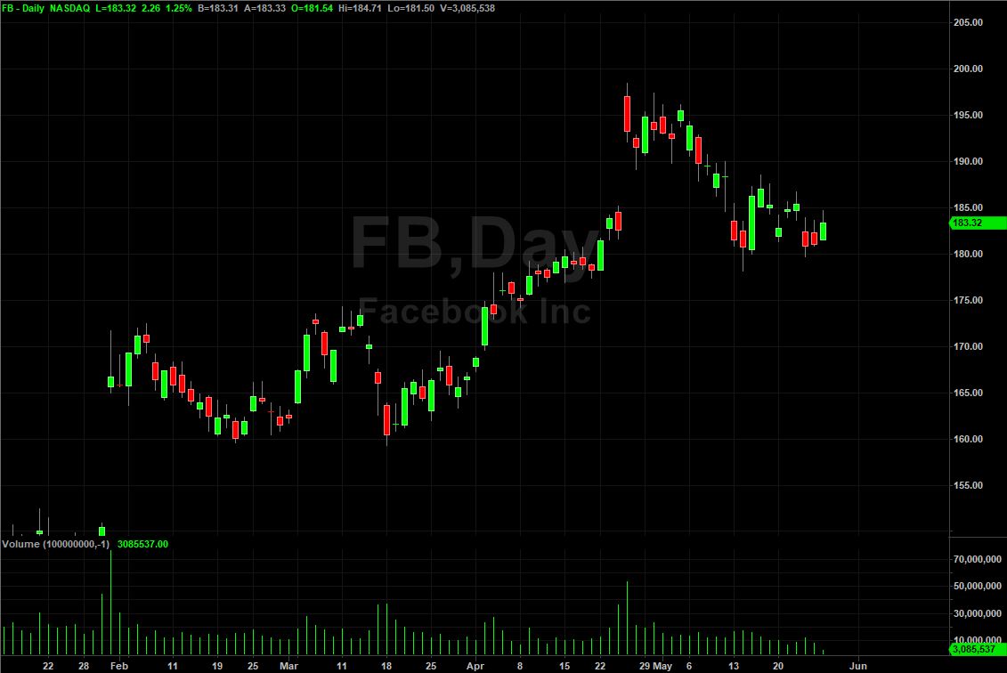
FB Candlestick Chart
The other popular charting technique for plotting price data in the stock market is candlestick.
Traders use candlestick charts to see the open, high, low, and close of a stock over a time frame. The body of a candlestick chart further allows you to know how a stock closed relative to its open. It is typically colored red for down days and green for up days.
The first price traded during the candlestick is the open, and is indicated by either the bottom or top of the body. The top of the wick that occurs above the body of a candlestick indicates the highest price traded during the time frame.
There will be no upper wick in the candlestick if the open was the highest price during the time frame.
The bottom of the wick that occurs below the body of a candlestick indicates the lowest price traded during the time frame. A candlestick will not have a lower wick if the open was the lowest price during the time period.
The last price traded during the time frame is the close, and is indicated by either the bottom or top of the body.
Candlesticks are by far the most popular charts because of the amount of information they display.
They show the intraday range, different types of candlesticks like hammers and shooting start which can help traders understand market sentiment quicker, and they work effectively on any time frame.
Identifying Trends
Trends are one of the easier things to spot on a chart. When stocks are trading in a set direction, whether up or down, they are said to be trending.

Above you can clearly see that Apple is trending higher for a few months. The trick with trending stocks is to trade with the trend. Trying to fight it can be costly.
Look for pullbacks to important support levels or moving averages for entries to join the trend higher, in this case.
We don’t know when a trend will end so a good rule of thumb is to stay in the trade until we get consecutive closes below a support level or a moving average.
Identifying Support and Resistance
Identifying support and resistance is one of the first things we teach new traders. These levels are where you want to be trading.

Above you can clearly see there is a defined level of support at the $26.75 price and clear resistance at $29.50. These levels mean there are buyers at the support prices and sellers at the resistance prices.
Why this is important is because if we know we can expect buyers or sellers to show up at a certain price, then we can expect a bounce to profit from.
Now obviously this doesn’t work every time, but it puts probabilities in our favor which is our main goal as traders. It also provides you with a favorable risk/reward ratio with a defined stopping point.
If we buy at support then we know we are wrong if it breaks below that price and can exit the position. The same goes if we sell short off resistance.
A good set up for trading support and resistance levels is a breakout trade. This happens when a defined level of support or resistance forms and prices break through it.
There are a couple things you want to look for on a breakout trade:
- High relative volume (volume picks up compared to previous trading periods)
- Prices hold above/below the level (ideally it breaks out and comes back and tests that level and holds, that’s a good entry point)
Breakout trades are very popular because you can catch bigger moves and make more money, which is what we want!
Why Stock Charts Are Important
A stock chart, particularly a candlestick chart, can tell you whether institutional investors and other big investors are heavily buying a stock or dumping it as fast as they can.
Traders can also use stock charts to tell if a stock is likely to keep bumping its head against a ceiling of resistance, or if it will find a floor of support from which it can continue jumping higher.
The other important thing to understand about charts is that they help you see what is really happening with a stock. Savvy investors use charts to spot anomalies and patterns, and to make wise decisions when buying or selling stocks. Charts help you spot timely sell and buy signals, and to analyze the health of a stock.
Bottom Line
There’s no doubt that learning to read stock charts can be daunting for some beginner traders. However, all it takes is some basic tips and continued practice to learn how to read them.
Once you do that, you will be able to utilize charts to find the best stocks to buy and spot the right time to sell.
In short, the combined information of a stock chart allows investors to make informed decisions as to whether to ignore, sell, or buy a stock.