


What Are Bollinger Bands?
Bollinger Bands are a technical indicator developed by John Bollinger in the 1980s that plot standard deviations around a moving average.
Here’s an example chart:

Bollinger Bands widen as price volatility increases and tighten as volatility declines. Wider bands imply a higher standard deviation, meaning that an average price is less likely to be concentrated near the mean.
Bollinger Bands are used to create context and structure around price.
It allows you to answer questions like ‘relative to this stock’s price history, is price high or low right now?’ or ‘is today’s price move part of the normal gyrations of the stock market, or is it statistically significant?’
The Normal Distribution
Bollinger bands are simply a tool that allows you to easily harness the statistical concept of standard deviations and normal distributions within your charting platform.
However, if you were put to sleep by your college statistics class like I was, allow me to explain the concept of standard deviations quickly. You can skip this if you’re already familiar.
In statistics, there’s this idea of a “normal distribution.” The normal distribution is a way to categorize the probability of something occurring.
It’s the most commonly used probability distribution in statistics and you’ve undoubtedly seen it’s visual representation, the bell curve, before.
Here’s an example using school grades for a class of 100 students:

This visual makes it simple to gauge how probable a range of outcomes is. The taller the center of the curve, the fewer outliers there are. When the center of the curve is shorter, the data has a much higher variance.
If you remember during the early response to coronavirus, there was a stress to “flatten the curve” from public health authorities.
Here’s a popular graph which you probably saw in March 2020, which illustrates it perfectly:

The emphasis was to flatten the height of the y-axis, or how many people had the virus at once.
The main difference between the yellow and blue curves is that if you were to select a person with coronavirus randomly, it’d be much more concentrated towards the mean in the blue curve (aka, most people were sick at the same time).
This is compared to the yellow curve, where the dates of sickness are more spread out.
The yellow curve has a high standard deviation: the average data point is more likely to stray from the mean.
The blue curve has a low standard deviation: the average data point is more likely to be concentrated near the mean.
The normal distribution is a neat way of organizing data into curves, which quickly tell us how likely an outcome is. Of course, the caveat is that the data is at all normally distributed, which many datasets are not.
Standard Deviations
The standard deviation of a dataset measures how much the average data point varies from the mean.
A low standard deviation means that most of the data is near the mean, while a higher standard deviation means that there is much higher variance in the data.
To apply this to stock prices, the more price volatility, the higher the standard deviation, and vice versa. A stock with a high standard deviation means that the price will very often sway far from the mean (in the case of Bollinger Bands, a moving average).
This stock’s Bollinger Bands will be very wide.
Bollinger Bands Formula
It’s essential to understand the math behind the indicators you use to make trading decisions. It’s also important to realize that academic math is confusing, and for some reason, the use of the Greek alphabet is standardized.
Here’s the formula for standard deviation:
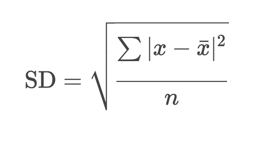
If you never paid attention in math class like me, there are some pretty easy articles explaining these concepts, like this one in Basic-Mathematics.
Once you understand the basic math behind standard deviations, the formula for Bollinger Bands is simple:
- Upper band plotted N standard deviations above the moving average
- Middle band: N-period moving average
- Lower band plotted N standard deviations below the moving average
How To Use Bollinger Bands in Your Trading
All trading strategies primarily take advantage of two market phenomena: mean reversion and trend following.
In a nutshell, mean reversion aims to enter stocks when they’ve significantly deviated from their historical mean, expecting the price to mean revert. Trend following assumes that stocks in motion tend to stay in motion and trade with the trend.
You can take advantage of both mean reversion and trend following with Bollinger Bands as a primary or secondary tool.
If you search Google or YouTube for ‘Bollinger bands strategies,’ the vast majority of them will mean reversion strategies.
Bollinger bands make visualizing a mean reversion trade simple. Using the statistical concept of the normal distribution, the bands allow you to quickly assess whether a price is ‘normal.’
If price is inside of the bands, it’s part of the normal market gyrations, if price is outside the bands, it’s a significant outlier.
Most Bollinger Bands strategies bet that, more often than not, price will return to the mean, rather than continuing in the direction of the outlier.
The uptrend pullback is one of the strongest and most straightforward trade setups in existence. The setup gets the best of both worlds: a little bit of mean reversion in that you’re buying a pullback, and trend following because you’re betting on trend continuation.
Bollinger Bands are a great tool for identifying trend pullback trade opportunities. Look for the bands themselves to be trending, higher highs and higher lows (and vice versa), and for the price to pull back to the counter-trend band.
Any further complications are simply optimization of the strategy. Your success in trading the core idea of mean reversion using Bollinger Bands depends on a few factors:
- Your ability to interpret the broader price action around the bands
- The market environment
Here’s an example of a simple Bollinger Bands trend pullback long trade setup:

Some context:
- Apple was a leading stock, a chief contributor index returns. As such, a beneficiary of constant capital flow
- Apple was in a sustained uptrend.
- The stock market was in a bull market
As you can see, while the above analysis is surface level, you require at least some context to have conviction in your trades.
Here’s an example of a poorly formed setup. I’m of course, picking a dramatically bad example for illustrative purposes. Most setups are closer to the periphery. My rule of thumb is, if it doesn’t jump off the page, there are better setups out there.

Some context:
- The stock is in a long-term downtrend.
- Sales and earnings are on the decline.
Bottom Line
Standing at close to 40 years old, Bollinger Bands are still one of the most prominent technical indicators out there, used by highly successful traders.
Sometimes the simple ideas, like using basic statistics concepts on stock prices, are the longest-lasting.
Even in an era of high-frequency trading and alternative data, Bollinger Bands still hold their rightful place in the trading world.